國際友會作品

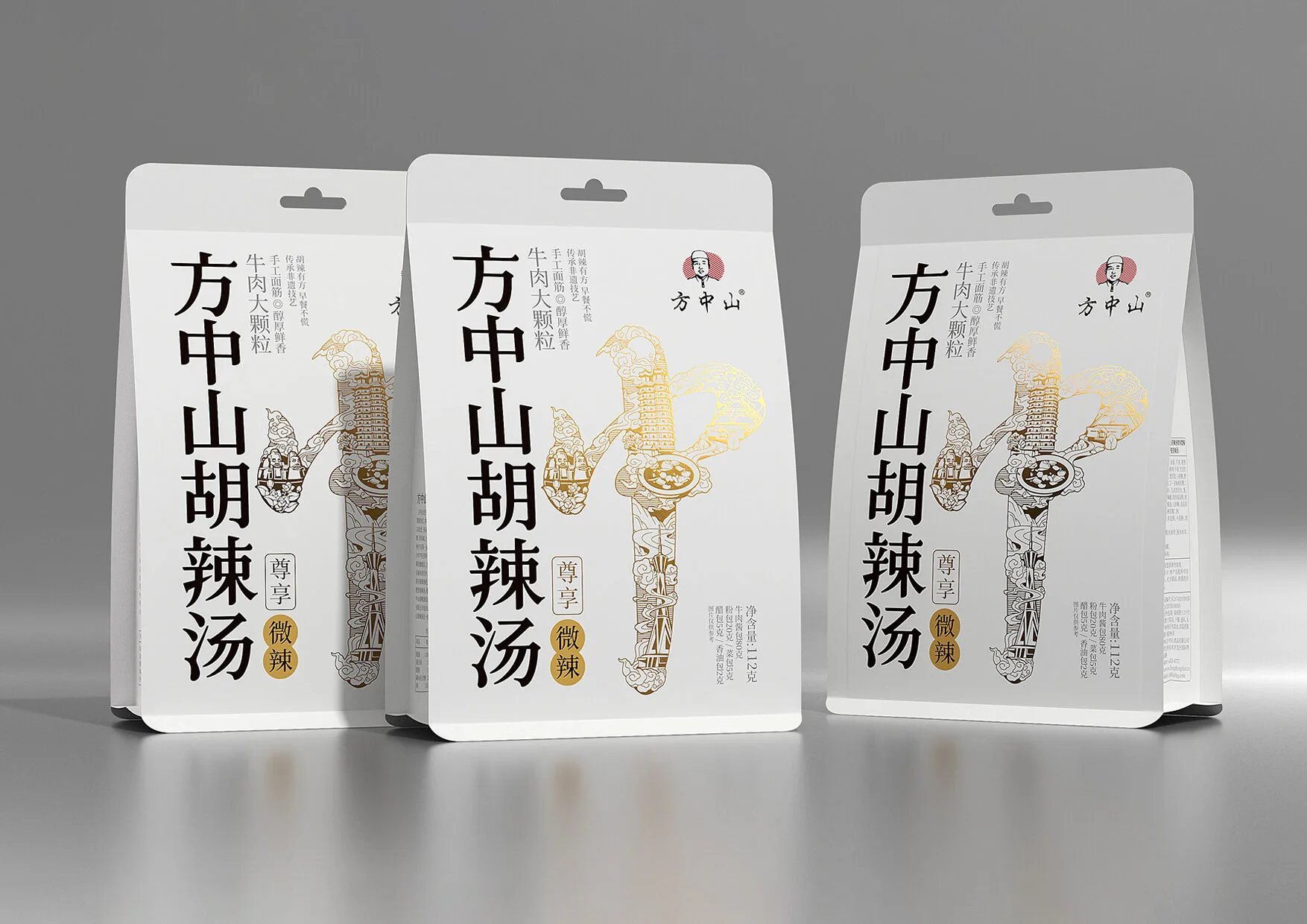
小时候,街边那一碗热气腾腾的胡辣汤,是每个清晨的温暖慰藉。不管是在外打拼的游子,还是忙碌生活的上班族,这熟悉又崭新的包装,只为给你带来那份家的温暖与安心。 品质至上,是设计师和方中山始终如一的坚守。此次新包装的诞生,从选材、制作到包装设计,同样历经严苛打磨。环保材质搭配独特工艺,不仅保障胡辣汤的纯正风味,更彰显对品质从内到外的执着追求。 在传统工艺与现代美学的完美融合下,以白色为底,点缀着温暖红金色的包装,宛如晨曦初照,温暖而明亮。一个大大的“中”极具冲击力,搭配上极具河南中原特色的图案和胡辣汤的食材。就像把河南的热辣风情都浓缩在了这小小的包装之上,彰显深厚饮食文化底蕴。
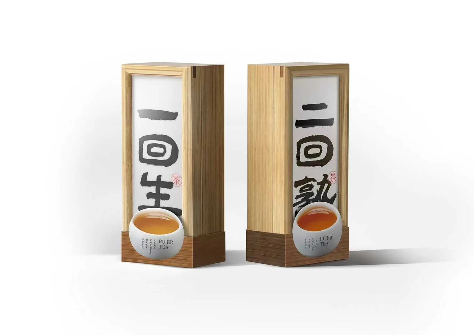
“一回生,二回熟”——这句俗语恰与普洱茶“生普”“熟普”的品类特性不谋而合。套装以此为题,将七日一盒的小茶饼设计为“一周生,一周熟”,十四天的时间跨度,既是人与茶的相识过程,也是情谊从浅到深的隐喻。
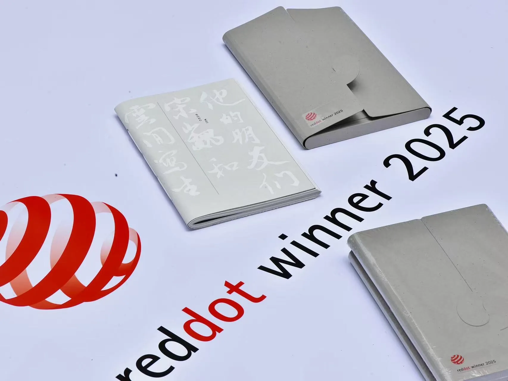
《云间写生|宋巍和他的朋友们》由上海师范大学美术学院饶正杉老师操刀设计,同昆匠心印制,以先锋设计斩获2025红点品牌与传播设计奖,开创了艺术书籍的全维感官叙事。 整部作品以四孔古线装为骨,将机械印刷与手工温度相熔铸,书籍函套盒结构巧妙的太极扣独具匠心,弧形钢线压纹化作五线谱般的视觉韵律,使宋巍笔下莲舟、绿云等意象在翻页间流转新生,成就一部可触可感的当代艺术诗卷。
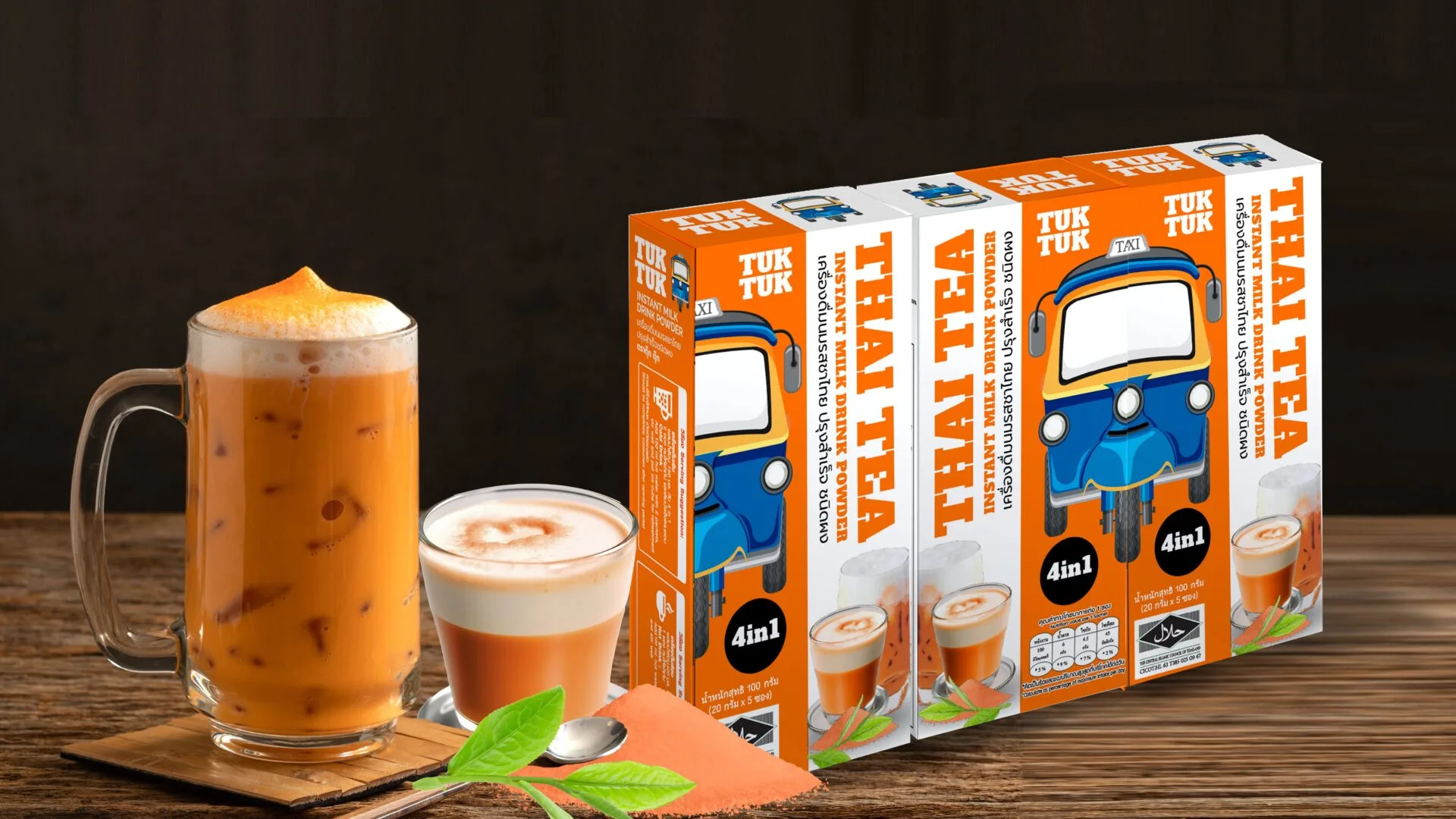
TUKTUK is more than a beverage; it is a celebration of Thai identity, agriculture, and creativity captured in a cup. Inspired by the iconic energy of the Thai "tuk-tuk," our brand bridges heritage and modern convenience. We transform premium, locally-sourced ingredients—like Pathum Thani pandan, Rayong Monthong durian, and Chumphon coconuts—into authentic instant drink powders that support sustainable farming communities. Our design philosophy mirrors the bold, lively spirit of Thailand. The packaging is crafted to be visually striking and memorable, blending traditional charm with a premium modern aesthetic that stands out on international shelves. From Coconut Coffee to Thai Tea, each preservative-free blend offers a smooth, balanced experience—simply add hot water. Whether for a home treat, a thoughtful souvenir, or a versatile HORECA solution, TUKTUK delivers the warmth and character of Thailand to the world, one authentic sip at a time.
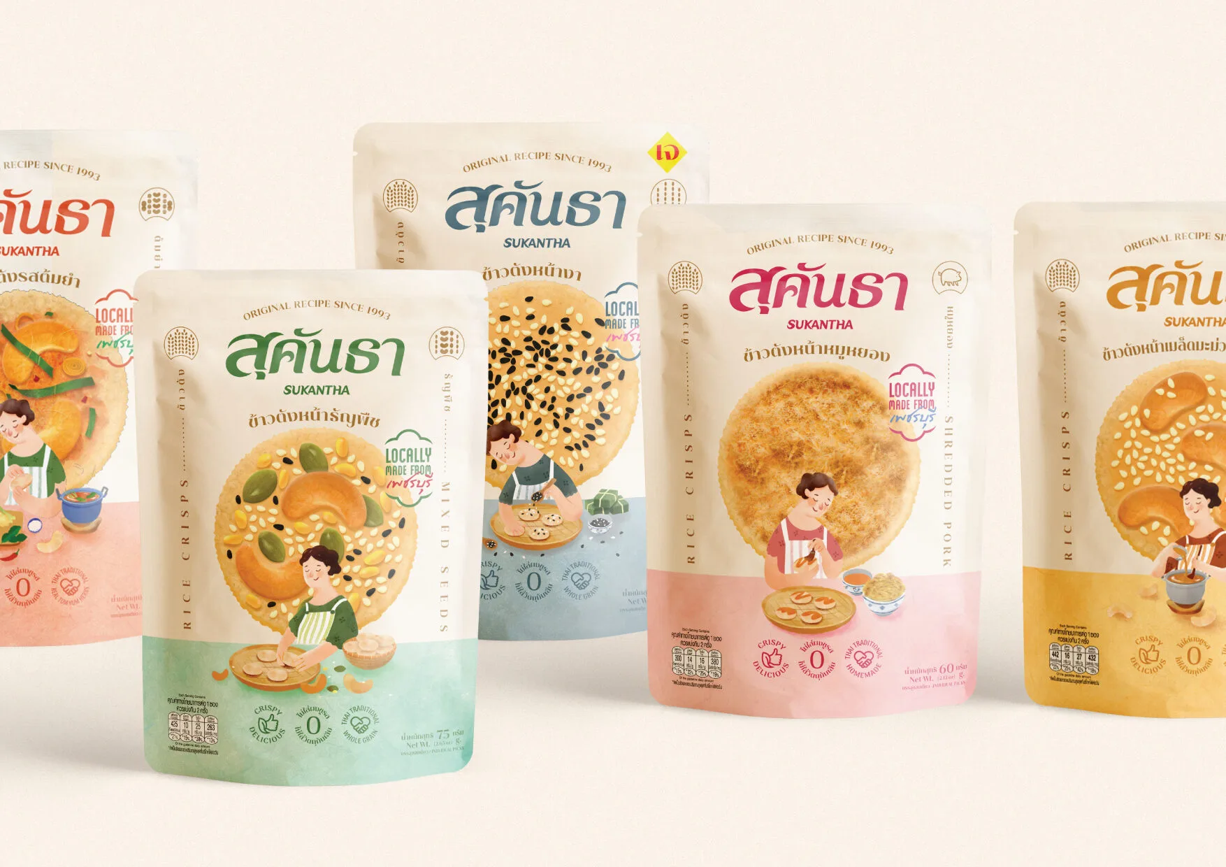
Sukantha’s packaging was inspired by the owner’s childhood memories—coming home to the comforting sight of their mother making rice crisps with care. This story was developed into a series of warm, heartfelt illustrations that bring out the personality of the brand. Each pack features a different moment in the homemade process, reflecting the dedication behind every bite. In order to balance the warm & homey feel with a design that honors its 30-year history, a serif typeface with contemporary details was chosen. Realistic illustrations of the rice crisps highlight the refined craftsmanship. This combination shapes Sukantha’s identity, deeply rooted in authenticity and heartfelt flavors. Beyond the illustrations, other brand elements also highlight the connection between consumers and the local community, emphasizing the use of the finest locally sourced ingredients. Sukantha remains a symbol of local pride, authenticity, and the simple joys of home.
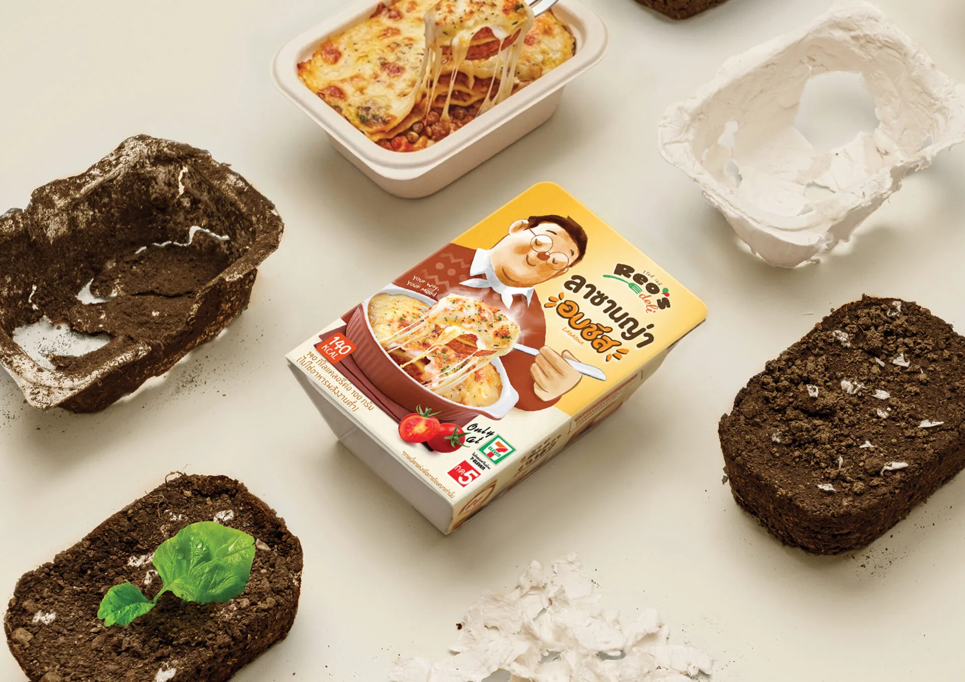
Reo's Deli presents a design concept rooted in "Back form the future" the project reimagines conventional plastic food trays by transforming them into biodegradable plant-fiber trays. After use, the tray returns to the soil and decomposes into organic fertilizer, which is then used to cultivate a new generation of spinach. This continuous loop brings the idea of a tangible Circular Economy to life through the experience of "Eat, Grow, Regrow." Beyond its environmental value, the packaging is designed for real-world usability. It is fully microwaveable without the need to peel or remove any components, simplifying the process while reducing heating time from 5 minutes to just 4 minutes. This enhances convenience, saves energy, and ensures safety for all consumers. At the same time, the packaging graphics are designed to stand out through the distinctive Papa Reo's character, strengthening brand recognition. This is complemented by appetizing food imagery that enhances visual appeal and elevates the overall consumer experience.
搜尋

140 台北市內湖區文德路210巷30弄65號2樓

TEL:+886-2-2797-7053

Copyright© Taiwan Package Design Association. All Rights Reserves.